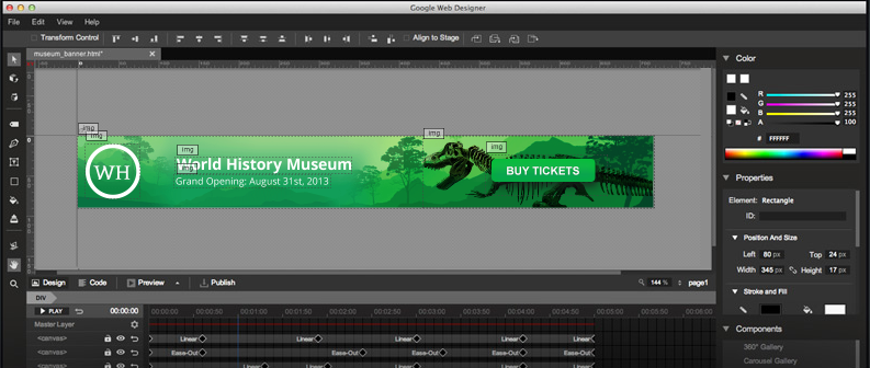
Yesterday Google released a new design tool going by the name ‘Google Web Designer’. I installed it and played around a bit. It seems like they got carried away with the title cause it certainly isn’t a web design tool in the sense of Dreamweaver, its more of an animated banner creation tool. Its output is an ‘HTML5’ document (sorry for the cliche) and uses both Canvas 2D and 3D elements to create banners in a user interface that reminds me of Adobe’s Flash (still have nightmares of that) and Adobe’s new animation tool Edge Animate. If you ignore this app’s bad title, its a pretty decent tool for making banners for AdSense or other purposes. The code produced by the tool is not the leanest but works on modern browsers, and even on mobile. To see the extend of how much overhead is included check out this gist on github; the author created a new document, drew a rectangle with a sold color and saved and that was the result. This means that if you are making a very simple banner, the CSS and Javascript overhead can be substantial (consider that each banner on a page will be running on its own IFrame); on the bright site it can do things without coding that you’d normally need flash for without losing mobile compatibility. Moreover it allows you to create responsive ads; a feature that Google’s own AdSense product now supports (after many years of publisher requests).
Even if it’s destined for ads, it doesn’t mean you can’t use it to put together a single page website, but lets hope that Google Web Designer won’t be the beginning of another ‘Flash’-like era where Canvas is used instead of the Flash container plugin leading to bloated, hard to maintain, and non-indexable websites all over again.
You can have a look of how it works here:
and download it for free here:
